Explore missing values in a dataset
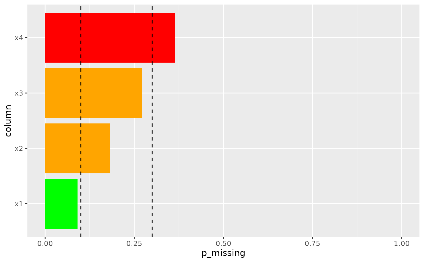
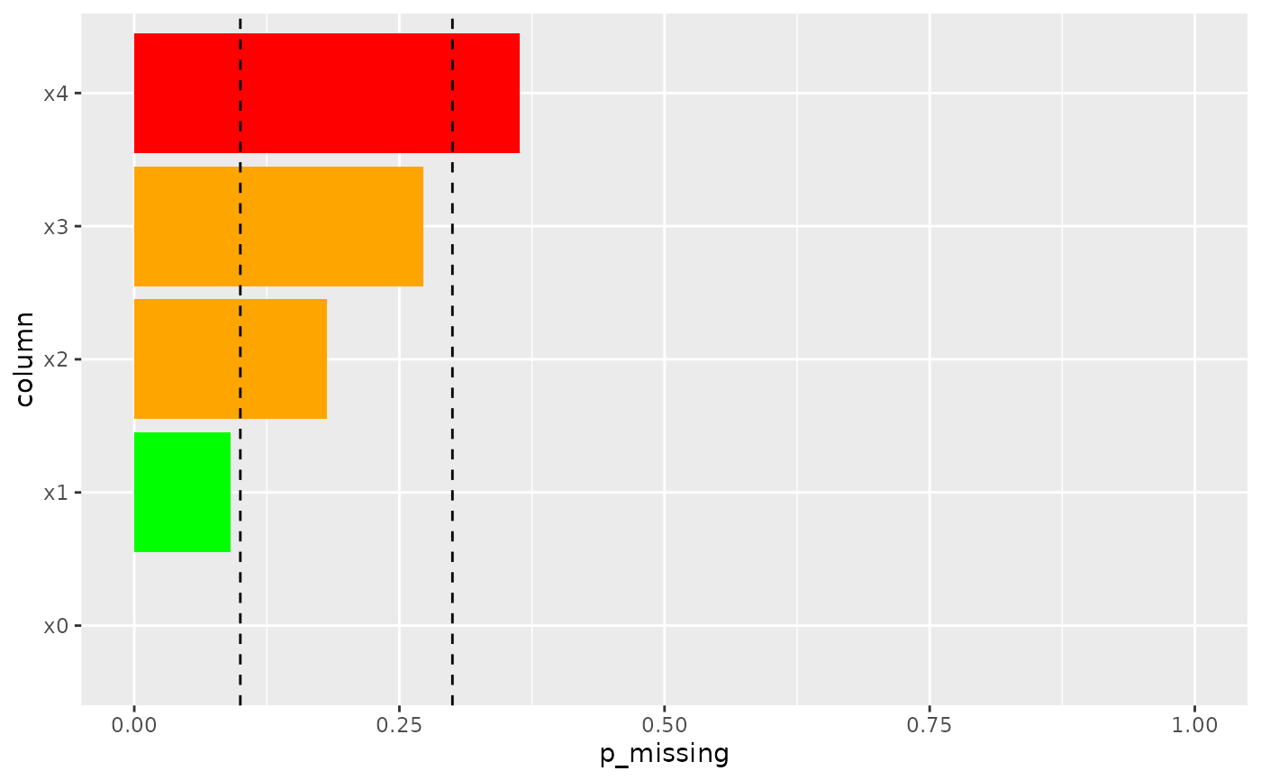
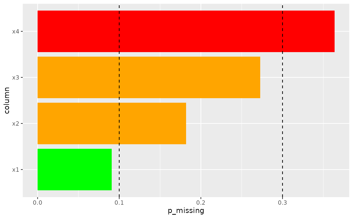
explore_na.RdPrimarily a visual tool, but also can tabulate the same, which allows exploration of the amount of missingness in a dataset. The visual shows the amount of missing data in each column.
Usage
explore_na(
  df,
  return = "plot",
  probabilities = TRUE,
  keep_all = FALSE,
  colour_thresholds = c(0.1, 0.3),
  zoom_in = FALSE,
  reference_lines = TRUE
)
Arguments
- df
dataset, of the class data.frame
- return
Either "plot" or "table", depending what you want the function to return
- probabilities
Do you want the amount missing reported in absolute (nrow) or relative (percentage)terms
- keep_all
Whether to include the columns which are not missing anything ie n_missing = 0
- colour_thresholds
The visuals give a RAG rating for the missingness depending on these thresholds
- zoom_in
Should the amount missing axis max out at 100 percent or the greatest non-zero amount missing?
- reference_lines
Should reference lines be drawn on the visual to show the thresholds used for the colours